Responsive Web Design or RWD, is one of the most popular design strategies in web development that allows a website to be flexible and work properly across all screen resolutions and on any device. More generally, RWD is a technique that makes sure the website development layout, content, and images match the device accessed by the user. This is important, especially in today’s business, because users are getting connected through multiple devices.
In any organization’s strategy, mobile responsiveness should no longer be considered a choice but a requirement. In the past, the majority of users only visited websites on their desktop computers. Today, mobile-first thinking prevails as a primary way of designing interfaces and user experiences because people rely on their mobile devices for various aspects of their lives. This trend is gradually building up and if it is not addressed by businesses, they are in for a loss. It is quite possible that we open a site on a smartphone, and all the text is too small to read, the buttons are small and hard to tap, or the layout is broken. This kind of disappointing experience can push users away from your site and lower the overall engagement rate or bounce rate of site. Lastly, neglecting to employ a responsive web design approach might cost your business potential traffic and sales.
Responsive Web Design’s Significance in 2024
In 2024, scale and flexibility play a significant role in e-business site design, particularly in the importance of responsive web design. In the digital era, where transitions are so frequent, the practice of using mobile devices as the primary tool for accessing the Internet remains relevant. The latest statistics show that mobile devices have become more than 50% of all internet traffic globally. Their drastic increase in adoption has changed the way companies think about constructing websites and using mobile optimization.

- Mobile-First Trend: As more users access websites via smartphones and tablets, the concept of mobile-first design has emerged. This approach prioritizes mobile devices during the design process, ensuring that websites are optimized for smaller screens first and then adapted for larger screens, like desktops. By prioritizing mobile, businesses can create a more consistent and positive experience for their users. For more on how mobile-first thinking is changing the landscape, check out our post on Flutter vs. React Native.
- Google’s Focus on Mobile Responsiveness: Besides user satisfaction, mobile friendliness has always been Google’s major priority. They now use their search algorithms to favor websites, which tell us how to improve mobile website usability. Indeed, websites that are not compliant with Google’s mobile-friendly guidelines are set to suffer a major blow in ranking levels. This keeps your site low in the ranks of search engine results, which means people searching for your line of products cannot easily locate your website and, by extension, your business. If your competitors have responsive website development and you do not, you can be sure that your competitors’ sites will rank well ahead of yours. Learn more about optimizing your site for Google’s mobile-friendly guidelines in our Guide to Creating an Effective Business Website.
- Growing Mobile Usage Statistics: Mobile usage persists as one of the most popular trends which develops very dynamically. Since content consumption, shopping, and general entertainment are increasing through mobile devices, businesses need to address this segment. Failing to embrace the mobile-first trend means that the company loses users who are on the lookout for better and more responsive services. When a business organization adopts the responsive web design approach, it can increase a bigger percentage of mobile clients as well as enhance customer loyalty. Discover how top companies are utilizing mobile optimization by reading about the 10 Best SaaS Website Designs.
Key Benefits of Responsive Web Design
Responsive web design is advantageous in many fundamental ways to the business. Mobile responsiveness comprises making the website usable on multiple devices to enhance the user experience and the performance of the site.
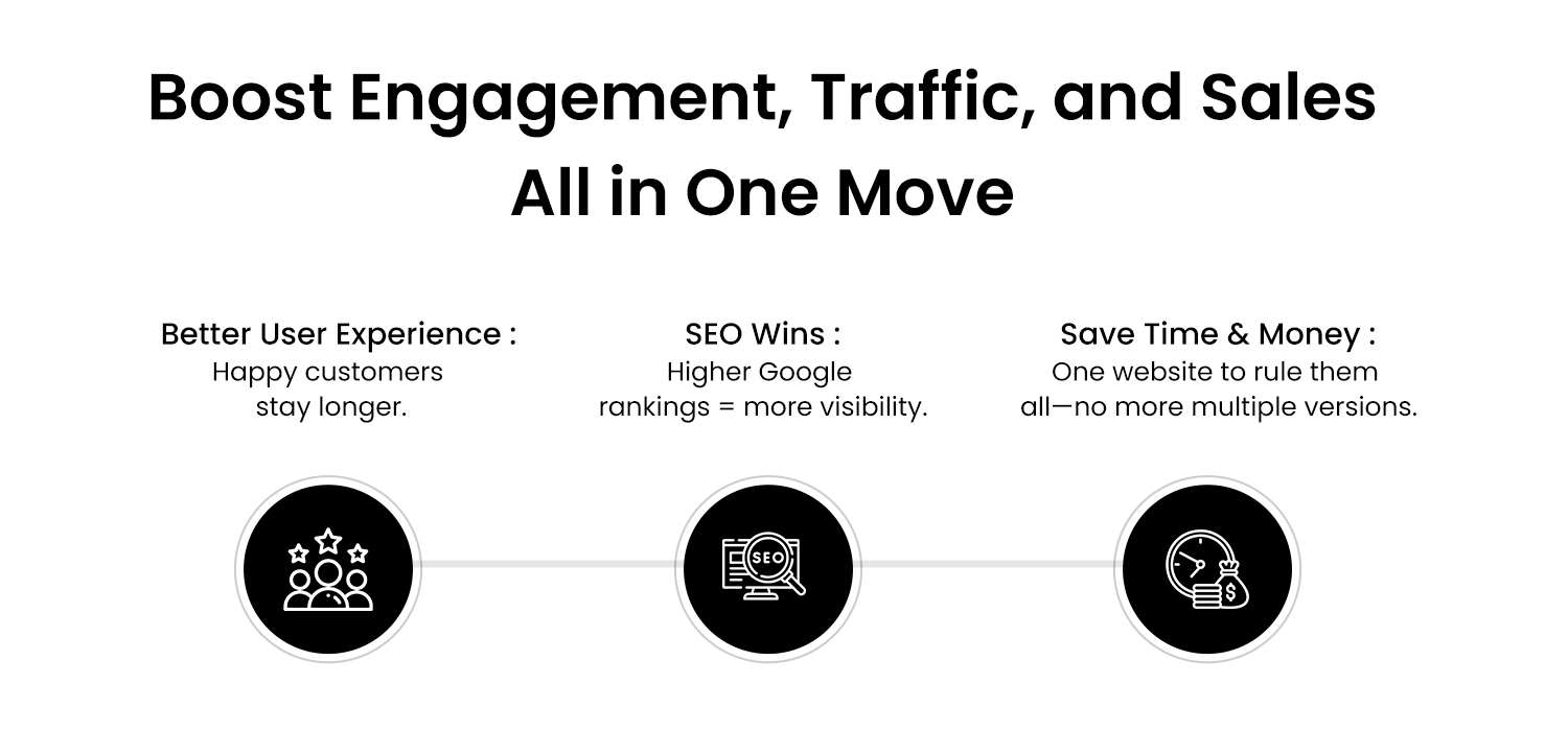
- Improved User Experience: The primary benefit of responsive design is that the user gets an optimal experience by getting through the website. SEO for responsive websites enables people to use Internet resources without any problem regarding the display, readability of the texts, and usability of such elements as forms and buttons irrespective of what kind of gadget is being used by clients. When all the information about a particular topic is sourced from your website, the likelihood of users spending more time on your website increases and hence increases the interaction rates among the customer’s higher conversion rates. For inspiration on user-centric designs, see our post on Construction Website Designs.
- Higher SEO Rankings: Another advantage of the use of responsive web design in the business world is the influence on SEO. A flexible grid means that elements like images, text, and buttons will resize and realign depending on the screen width, ensuring a smooth experience across devices. Hence, websites that adapt to mobile devices are likely to rank higher in Google since it was created to rank business websites accordingly. People trust search engines, and when you are rated higher, you get more traffic, better brand awareness, and more opportunities to convert prospects. Nowadays, those entrepreneurs who haven’t adopted the use of SEO for responsive generated websites are most likely to lag.
Responsive web design can significantly impact SEO. Explore the importance of SEO in our article on Choosing the Perfect Web Design Agency for Your Redesign. - Cost-Effectiveness: Having a website specific to mobile users and another website specific to desktop users is costly as well as ineffective. Responsive design saves you the agony of having to manage several versions of the same site, but only one is sufficient. Another one of the responsive web design benefits is the ability to reduce costs. Not only does it make economic sense to avoid the double development and maintenance expenses, but it also makes sense from the point of view of organizational synergy to have your team focused on one platform. For cost-effective design strategies, check out our insights on Cheap Website Design.
- Faster Load Times: The speed of loading is a key factor in usage experience as well as SEO ranking. Responsive website designs are often optimized for speed and are especially important for the mobile site. This way, optimizing items such as images and scripts will help in reducing the time taken to load this will retain users on the site and will help improve the search engine rankings. Web speed greatly contributes to visitors’ impressions and could easily persuade a visitor to stay on the site and engage, rather than leave due to slow download time, which could lead to less conversion. Learn more about optimizing website performance in our post on A Web Development Company Guide.
Step-by-Step Guide to Implementing Responsive Design
To implement responsive web design, businesses should follow these critical steps:
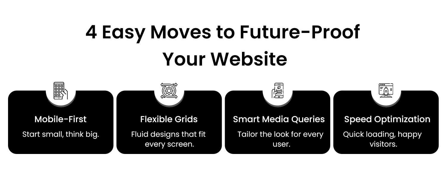
Mobile-First Approach: One approach to achieving responsive design is to plan and develop your website for the smallest available screen size, a smartphone, and then expand the design for greater screen sizes. It makes the primary user interactions possible and focuses on how information examples will be seen on a tablet or smartphone. When you go on to the tablets and other desktop designs you are allowed to incorporate more features as well as more layouts.
Flexible Grids and Layouts: Accommodate the layouts by using both flexbox and grids as well as follow CSS frameworks to make the layout to fit the various screens. A flexible grid means that elements like images, text, and buttons will resize and realign depending on the screen width, ensuring a smooth experience across devices.
Media Queries: These are CSS rules that enable you to use different specifications depending on the properties of a given user’s device, including width or orientation. Media queries let you change layouts, font sizes, and images to ensure that users of all types of devices will experience a site in the best way. This is a very important method of enhancing the mobile website user experience.
Image Optimization: Images used should be optimized to enhance their performance and to reduce the time taken to load them. Responsive images can help you use the appropriate sizes to display an image depending on the type of device a user is using because large files will not be ideal for displaying your website development on small screens of mobile devices.
Best Practices for a Responsive Website
When creating a responsive website, it’s essential to follow best practices to ensure a smooth, user-friendly experience across all devices:
- Simple Navigation: Beautiful, easily navigable menus should also be designed. The most important change was that a single-column layout should be adopted for better flow and easy-to-follow navigation of mobile websites.
- Readable Text Without Zoom: You also have to make sure that your text is easily readable on every device by using the correct fonts, both sizes and spacing. It is rather inconvenient that to read content within the mobile application, a user has to zoom in. Maintaining readability is crucial for avoiding bounce rates and ensuring that users stay engaged with the content.
- Optimized Touch Interactions: Since most customers use touch screens to interact with your website, check if buttons and links are properly large for touch. Do not put buttons close together so that the users can’t accidentally click and make interactions on your websites as easy as touching the screen.
Case Studies: Businesses Benefiting from Responsive Design
Numerous businesses have seen dramatic improvements after implementing responsive web design:
Company A: A business like Company A redesigns its website and gets a 35% boost in online mobile conversions. So, by enhancing the mobile optimization, they developed a straightforward design that augmented sales.
Company B: With the launch of their responsive website, Company B experienced a 50% increase in website traffic and a 40% boost in sales. The implementation of responsive web design helped them capture a growing mobile audience and significantly improve their bottom line.
Common Mistakes in Responsive Web Design and How to Avoid Them
While the benefits of responsive web design for business are clear, there are common mistakes that businesses should avoid:
Ignoring Optimization: Just like not having optimized text for various resolutions, limiting image and video sizes may hinder the page loading time on mobile devices. Ensure all the media involved is as fast and efficient as possible.
Overcomplicating Layouts: Having too many rooms can be distressing to manage on small-screen devices such as mobile phones or tablet devices. In this regard, ensure that your design is clean and minimal to allow the adaptation of the site across the different devices.
Lack of Testing: One of them is an inability to properly assess your website’s usability across multiple devices and screen sizes, which is crucial. Recommended browsers and devices should be employed in readiness testing before nearing the website’s launch.
Future-Proofing Your Business with Responsive Design
In this emerging generation, things tend to go digital, and so do business practices. Responsive web design is an ideal solution for today’s website, and it has to adapt to the increasing number of devices and screens used by the public. Being prepared for new facets of mobile optimization and designing in advance guarantees your business stays open for newcomers for years.
Conclusion
To sum up, responsive web design must be considered a crucial condition for effective functioning in modern conditions by enterprises of any branch and any degree of scale. Providing websites optimized for various devices is possible if such aspects as the mobile-first approach, flexible grid, and image optimization are considered. Implementing responsive web design today is about guaranteeing the future for your business, getting a higher SEO ranking, and improving users’ experience.
Don’t wait—start optimizing your website for all devices now. By implementing responsive web design, you’ll create a better user experience, increase your website’s visibility, and drive more traffic and conversions.
Latest Post

