E-Commerce has grown significantly in importance in the realm of online shopping, so you may purchase anything with only a few clicks. It enables companies to sell goods to customers throughout the globe. However, having an online store is insufficient. Web design is useful in this situation.
Imagine entering a disorganized store where items are dispersed around and you are unable to locate what you are looking for. I assume you would depart. On a website, the exact same thing can occur. If it’s poorly designed, customers can walk away without purchasing anything.
It goes beyond merely making things appear good in web design. Making the website simple to use is the goal. Everything matters, including the layout, colours, and buttons. A well-designed website increases the likelihood that customers will trust it and feel comfortable making purchases from it.
We’ll look at how certain web design elements, user friendliness and conformity with a brand’s design, may help an online business succeed. We’ll also look at how an appealing website may aid in both increasing traffic and visibility on search engines. The significance of having an efficient eCommerce website will now be discussed.

Navigating eCommerce Success through Effective Website Design
Web design rises as the unsung hero, influencing the accomplishment of eCommerce endeavours in the hectic world of online buying, where a digital storefront counts just as equally as the actual one. Let’s examine the foundational components of a well-crafted eCommerce website design.
Crafting the Perfect eCommerce Website
Creating a website’s appearance is at the heart of web design. The combination of colours, forms, pictures, and text results in a user-friendly and aesthetically pleasing digital environment. Consider it creating a virtual space that showcases the identity of a company and encourages visitors to stick around and explore.
Building the Ideal eCommerce Site
- Visual Appeals and Branding: Because first impressions count, it’s important to consider visual appeal and branding. An eCommerce site that is well-designed employs fonts, graphics, and colours that complement the brand’s aesthetic to subconsciously appeal to visitors right away.
- User Experience (UX) and User Interface (UI) Design: UI and UX are similar to the hosts of an online shopping experience. UI is concerned with the arrangement, buttons, and layout of items. UX is concerned with how simple and pleasurable it is for consumers to browse, locate the items they need, and complete purchases.
- Responsiveness and Mobile-Friendliness: Your eCommerce site has to look great on all displays in a world when everyone has a smartphone. When using a computer, tablet, or smartphone, your site will always be accessible and appealing because of responsive design, which adjusts effortlessly to multiple devices.
- Navigation and Site Structure: Imagine navigating a confusing store; that would be difficult, wouldn’t it? Similar to this, a well-designed eCommerce site seamlessly directs visitors. Visitors may easily make their way around the site without getting lost, thanks to clear navigation menus, organised product divisions, and an intuitive structure.
By mastering these elements, you are creating an experience rather than merely a website. Visitors are more inclined to remain, browse, and eventually make a purchase when every time they click, and scroll, and action seems effortless.
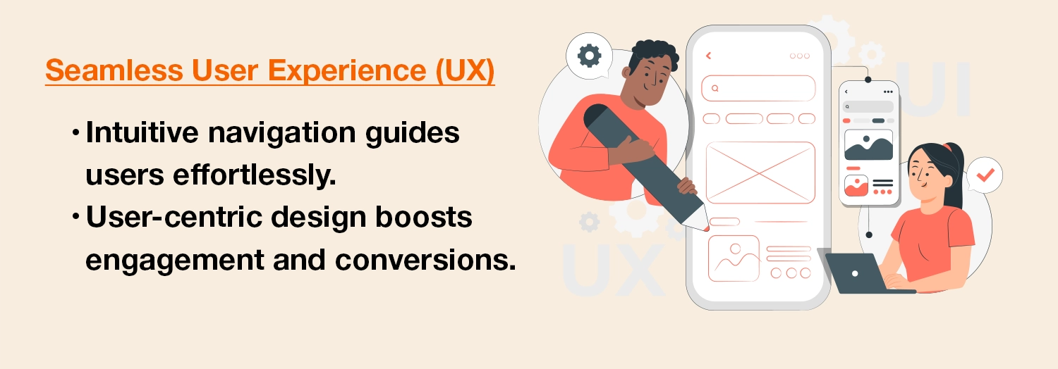
User Experience (UX) Enhancement with Effective Web Design
Delivering flawless user experiences is essential for success in the world of online commerce, and your website’s design plays a crucial role in this effort. Let’s look at some tactics for improving user experience through thoughtful site design.
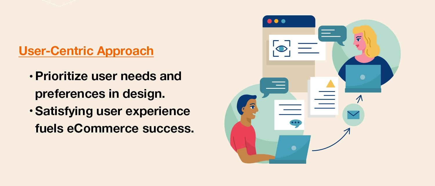
The Importance of User Experience for eCommerce Success
User experience stands out as the key to success in the changing world of digital commerce. Visitors to your eCommerce site may change into loyal customers, thanks to the flawless and interesting trip you provide. These successful relationships not only create trust but also consumer loyalty, setting the stage for long-term company expansion.
Designing a Strategy for an Improved User Experience
- Intuitive Layout and Transparent Product Categorization: Easy Navigation is made possible by an intuitive website style and transparent product categorization, just like in a well-organized physical store. User discovery is streamlined by clear product classification and thoughtful placement of navigational cues, creating a smooth trip.
- Outstanding product images and multimedia: Visuals have a big influence online. Customers may virtually engage with things, thanks to excellent product pictures and interactive multimedia displays that fill the gap between their virtual and physical buying experiences.
- Easy Checkout: A lengthy checkout procedure can put even the most ardent shopper to sleep. You may decrease friction and increase the chance of successful transactions by designing an easy and secure checkout experience with few stages.
- Intelligent recommendations and personalization: Using user behavior data to provide tailored experiences is similar to having a personal shopper on hand. You may increase engagement and foster a feeling of individualized attention by customising suggestions based on surfing and purchasing patterns.
By paying careful consideration to these design components, your website transforms from a simple platform into an engaging, user-focused refuge. By putting user experience first, you build the basis for deep connections, increased conversions, and ultimately an eCommerce business that succeeds in the digital era.
Building Credibility and Trust Through Smart Web Design
In the constantly changing world of online trade, trust is the key to success, and the layout of your website is the first step in establishing this crucial connection. Let’s examine how design components help to build visitors’ confidence and trustworthiness.
Building Trust: How Design Affects First Impression
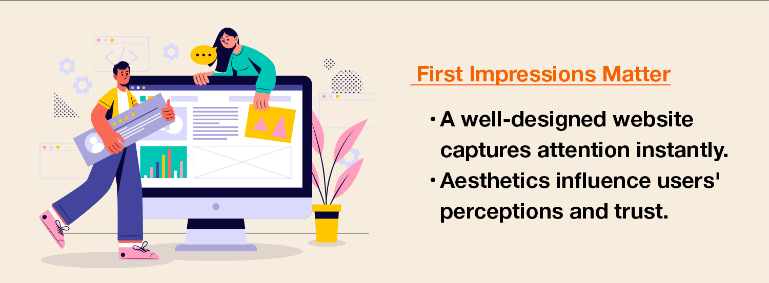
In the digital world, the proverb “first impressions last” holds true. A carefully constructed website design not only captures users’ attention, but also conveys professionalism and dependability. Every aspect of design, from the aesthetically pleasing colour scheme to the thoughtful arrangement, helps to shape perceptions and provide an initial sense of confidence.
Promoting Transparency to Foster Trust: Clearly Identifying Contact Information and Safety Indicators
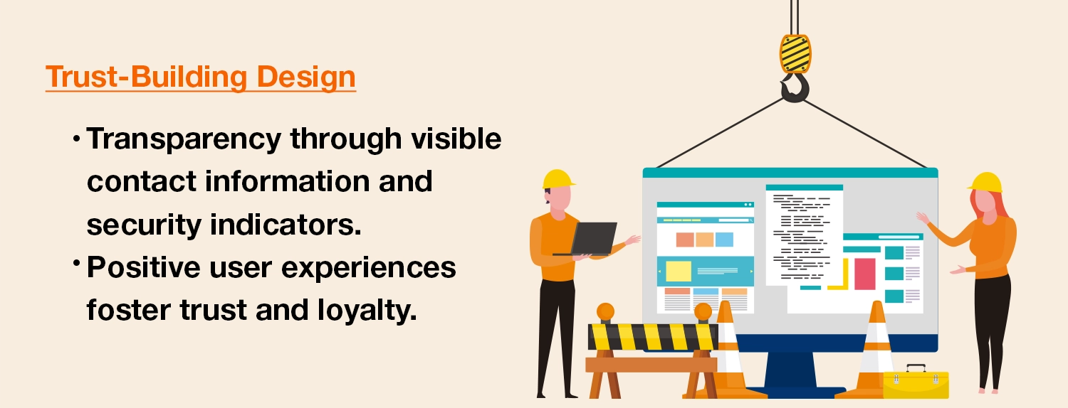
Nothing fosters trust like openness. You may reassure customers that there are actual people waiting to help behind the digital facade by prominently displaying contact information that is both clear and easy to find. By using security indications like SSL certificates or trust badges, you can reassure customers that the website is a safe place to conduct business.
Testimonials: The Views of Contented Clients
Your credibility is supported by a chorus of raving customer evaluations and endorsements. By including these real voices in your design, you add a personal touch and show how your goods and services have an actual impact. Customers are more inclined to believe the opinions of their peers than merely your marketing promises.
Professionalism in Visual Design
Visual components are crucial for conveying professionalism. A trustworthy brand is perceived as having clear, high-quality graphics, well-structured and clean layout. The uniformity of the website’s design components maintains the appearance of thorough attention to detail and increases your reputation.
Since there are fewer face-to-face encounters in the digital world, your website provides the main channel for establishing credibility and trust.
Designing for Mobile: Meeting the Needs of the Mobile Consumer
In a time of constant change, designing for mobile devices strategically is essential if you want to appeal to the always connected consumer. Let’s investigate the world of design that is mobile-friendly.
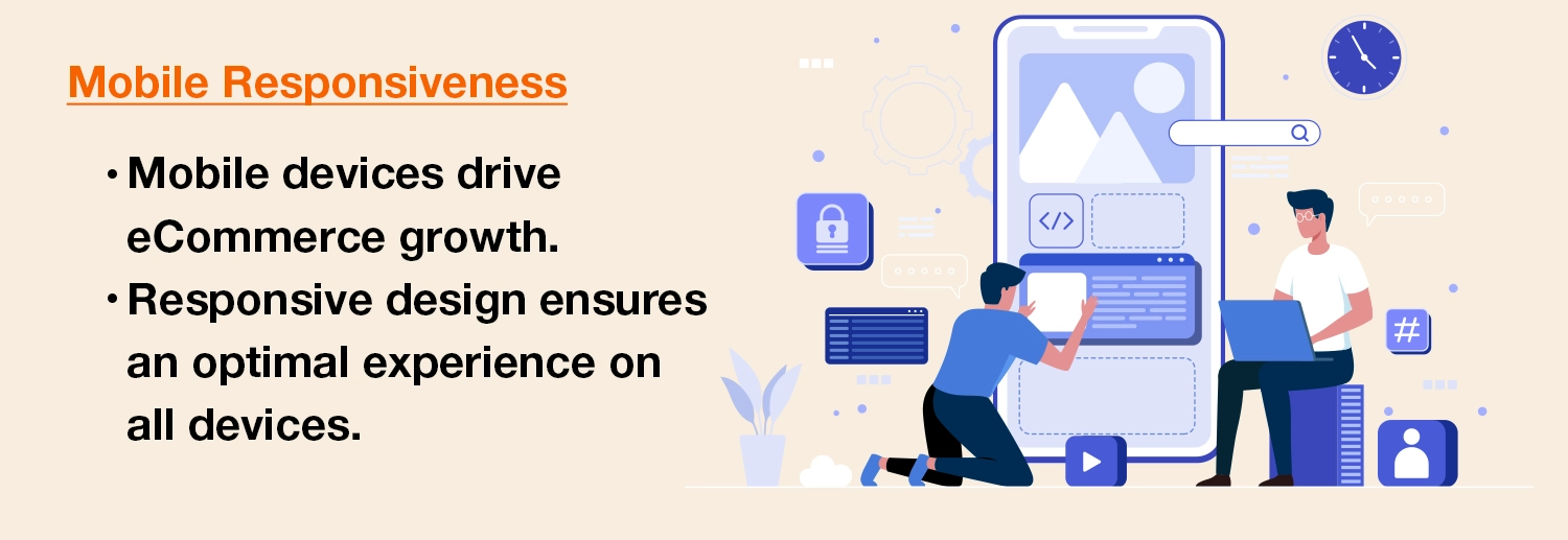
The Rise and Importance of Mobile eCommerce
People now purchase on their mobile devices while waiting in queue, travelling, or even just unwinding. Due to the rise in mobile eCommerce, it is now imperative that websites effortlessly adjust to the displays of cellphones and tablets. Overlooking this trend is like to closing your doors to a sizable percentage of your prospective clients.
Multi-device Accessibility Requires Responsive Design.
Enter responsive design, a strategy that guarantees that your website appears and works flawlessly across a variety of devices. Responsive design makes sure that your material is smartly re-organised across all devices, whether it’s a small smartphone, a convenient tablet, or a panoramic desktop computers, ensuring ideal viewing without straining or tedious scrolling.
Customising the Mobile Odyssey’s Design
- Touch-Friendly Buttons and Interactions: Mobile devices depend on touch, hence it is necessary to redesign buttons and interactions to be touch-friendly. A frustration-free experience is ensured by designing buttons that are simple to tap and engage with using a finger. Design accuracy becomes crucial to reducing unintentional clicks.
- Rapid loading on cellular networks: The digital age’s hyper-speed pace also applies to loading times. Mobile consumers, who frequently rely on mobile networks, are not patient with slow websites. Fast loading speeds are made possible through image optimisation, code simplification, and the use of caching technologies. This helps keep users from leaving your site too soon.
Mobile gadgets have become dependable allies amid the chaos of modern life. This fact must be included into your website’s design in order to provide consumers with a smooth and interesting experience regardless of wherever they are or what kind of gadget they are using.
Getting Search Engine Optimisation (SEO) and Web Design to Work Together in Harmony
The subtle combination of SEO and site design creates melodies of increased exposure and user engagement in the symphony of online success. Let’s see how these two crucial elements interact.
Exploiting the Mutually Beneficial Relationship between SEO and Web Design
Imagine a business with exquisite design that is tucked away in a back alley. No matter how amazing it is, its potential will stay unrealized if no one discovers it. Similar to a buried jewel in the broad digital world, site design without SEO. The relationship connecting the two is comparable to a limelight that draws attention to your digital creation.
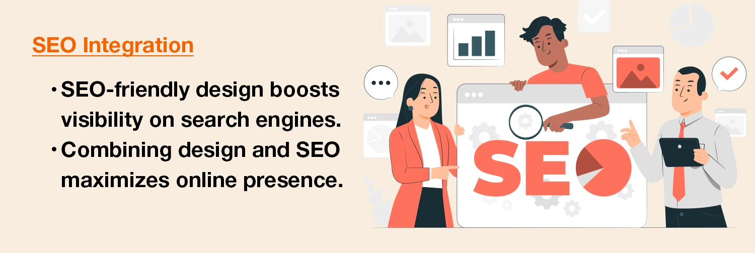
The Importance of SEO-Friendly Design Components
- Optimised Images and Multimedia: Catchy images and multimedia improve your website’s attractiveness but, if not optimised, they can also make it load more slowly. Design that is SEO-friendly strikes a balance between aesthetic appeal and image optimisation to ensure quick loading times without sacrificing quality.
- Clean Code and Speedy Loading: Clean and effective code, which lies behind the surface, sets the path for quick loading times. Websites that load rapidly receive better ranks from search engines. The user experience and SEO performance are both enhanced by a clean, well-organized codebase.
- User Engagement and Mobile Responsiveness: The revolution in mobile devices has altered the rules of the online game. Search engines reward websites that gracefully adjust to different screen sizes and provide a consistent user experience across devices. Due to visitors’ convenience in exploring on any device, this mobile friendliness not only improves SEO but also user engagement.
SEO and site design are not separate entities in the dynamic world of online exposure; rather, they work together to advance your online presence. In addition to guaranteeing your website’s accessibility, a well-balanced incorporation of SEO-friendly design components raises its search engine rating.
Creating an Everlasting Impression via Aesthetics and Branding
The art of web design is the stroke that creates a lasting impression in the world of eCommerce, where aesthetic appeal reigns supreme. Let’s look at how branding and aesthetics work together to create a memorable digital experience.
Explicitly Defining the Visual Core of eCommerce Design

Visual attraction is a must in the tapestry of online purchasing, not merely a bonus. Web design goes beyond practicality; it turns your online area into an alluring setting that encourages users to explore. The combination of colour scheme, font, artwork, and layout results in a digital work of art that piques interest and encourages interaction.
The Thread of Consistency: Branding Elements
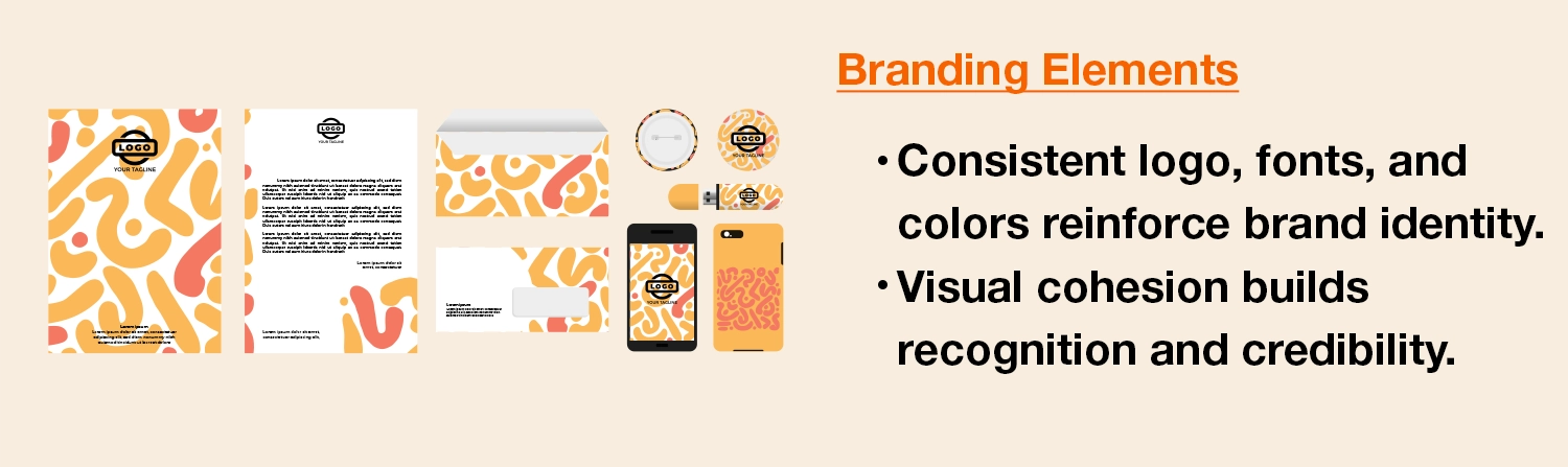
Branding is more than simply a logo; it’s all creating a memorable brand that sticks in customers’ minds. Every design detail, from the positioning of the logo to the font selection, should reflect the character of your brand. By maintaining consistency throughout your website, you can make sure that your business’s visual identity gets automatically associated with the goods and services you provide.
Exposing Colour Psychology’s Power
Colours have a unique power to arouse emotions and shape behaviour. Colours have the power to influence people’ perceptions and decisions when used effectively in design. While tranquil blues and greens emanate reliability, warm colours like orange and red may evoke a sense of urgency.
Making your website attractive is only one aspect of the union of aesthetics and branding; another is creating an engaging path for your visitors. Your brand’s essence is being etched into its electronic fabric through design, creating a relationship that extends beyond simple business dealings.
Getting Users to Take Action: Managing the Conversion Process
The layout of your website acts as a navigational light, guiding consumers through the confusing world of eCommerce, wherein clicks result in purchases. Let’s go out on a journey to investigate the art of leading visitors to make decisions.
The eCommerce Conversion Funnel: Decoding
Think of a funnel with a wide top and a narrow bottom. This funnel replicates the path visitors travel on your website, which begins with discovery and ends with a successful purchase. It is essential to comprehend this route, also referred to as the conversion funnel. Every stage of this journey, from gaining attention to closing the transaction, is significantly shaped by design.
Making Clearly Visible Calls to Action (CTAs)
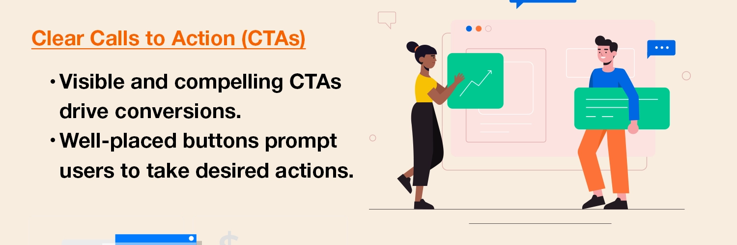
The call-to-action (CTA) is the compass leading users through the conversion process. These are the links or buttons that demand consumers “Buy Now” and “Add to Cart.” Users won’t lose track of their next move if CTAs are designed to be visible, alluring, and properly positioned. Bold hues, interesting writing, and logical arrangement catch the eye and promote engagement.
Simplifying the purchasing procedure
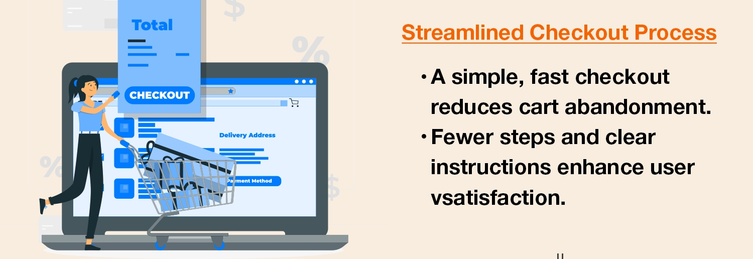
How annoying would it be to encounter a closed door at the final point of a maze? Similar to this, a complicated checkout procedure might put off customers just as they’re about to convert. A well-thought-out checkout procedure is comparable to an unlocked door that calls clients to finish their purchase without hindrance. The seamless experience that results from clear actions, few form fields, and simple payment alternatives increases conversion rates.
Design choreographs each step of the complex dance of conversion, from the first meeting to the victorious click of the “Add to Cart” button. Every design aspect plays a part in moving consumers towards becoming devoted clients, from generating aesthetic attractiveness to streamlining interactions.
Future Security via Adaptability in Design: Embracing Change
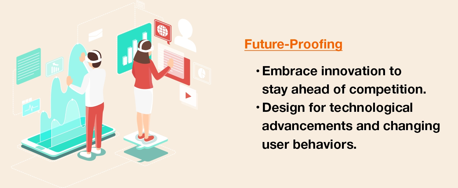
The layout of your website serves as more than simply a picture in time in the dynamic world of eCommerce, wherein trends change and technology improve; it’s a roadmap for future success. Let’s explore how to embrace flexibility and future-proof your design to stay one step ahead of the competition.
Riding the Wave of Technological Evolution and Design Trends
Similar to a tide, the digital environment is continually changing and evolving. Effective web design isn’t static with changing trends and cutting-edge technologies. By implementing flexible design for different devices and utilising artificial intelligence, you can keep your website interesting and relevant by embracing innovation.
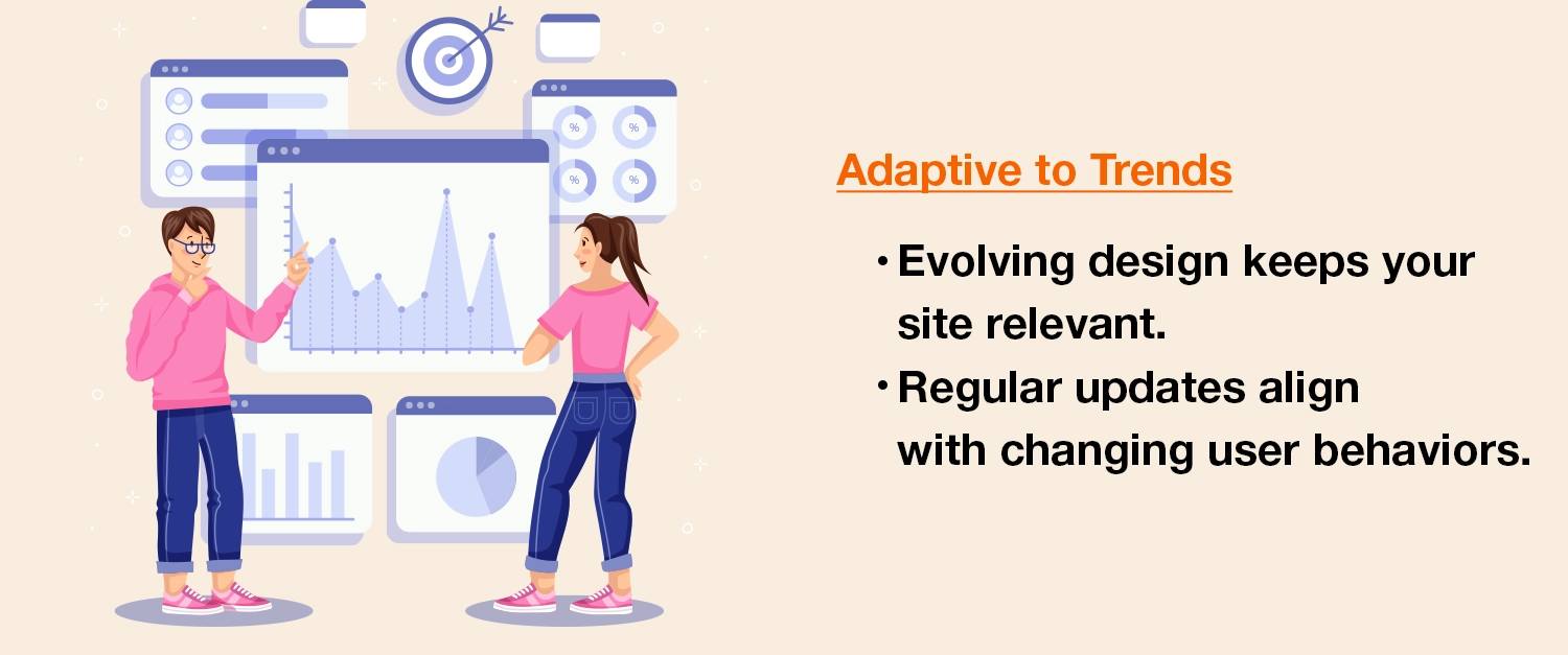
Understanding Changes in User Behaviour: The Art of Flexible Design
User behaviour might abruptly alter its path like a river. You may adjust your design to better suit your audience’s changing demands by being aware of their preferences and foreseeing changes in their behaviours. An adaptive design is essential to preserving user interest, whether it’s altering navigation patterns or optimizing for voice search.
The Practise of Regular Website Audits and Updates
Consider your website to be a living thing. Its health and lifespan depend on routine checkups and upgrades. Periodic website audits can assist pinpoint problem areas, such as antiquated design components or bottlenecks in the user experience.
Adaptability fills the needle that sews the past, present, and future together in the tapestry of design. An effective tool for engagement, transformation, and brand expansion is a website that can quickly adapt to new trends and changing user expectations.
Conclusion: Using Smart Design, Achieving eCommerce Success
On our journey, we looked at how developing a website is similar to laying up a road plan for online success. We gained knowledge on how to make things appear attractive, perform effectively on mobile devices, and facilitate simple product purchases. Remember that design is about having your website perform well for clients, not only about making things nice.
Businesses need to put a lot of effort and thought into creating smart, user-friendly websites since the internet landscape is always evolving. They can ensure that customers enjoy their purchasing this way, because customer satisfaction is what drives achievement in the digital age.
Latest Post
